



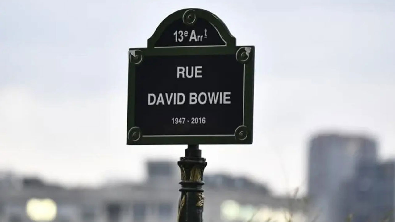
23 Mar Street sign typography
DESIGN IN THE CITIES
STREET SIGN
TYPOGRAPHY
An often overlooked but essential aspect of urban visual heritage: the font of our streets, from “Parisine” to London eclecticism.
In Paris, an often overlooked but essential aspect of urban design is the typography of street signs. These signs, true elements of visual heritage, play both a practical and an aesthetic role.
The font used on Paris street signs is a distinctive element of Parisian design. The choice fell on a single clear, simple, and functional typography with the **Parisine** font. Created specifically for the capital’s street signs in 1996 by the RATP (Régie Autonome des Transports Parisiens), it ensures perfect legibility for both pedestrians and motorists.
London’s Eclectic Approach
In comparison, London favors a more eclectic approach to urban signage, with a variety of fonts and styles depending on the different districts and types of signaling. Although legibility remains paramount, London’s graphic design varies more, reflecting a certain cultural and historical diversity of the city.
Coming Soon
And what about typography in the metro? We will soon bring you a short history of typography in the Paris and London undergrounds. To be continued.
No Comments